When Being Imperfect was Perfect
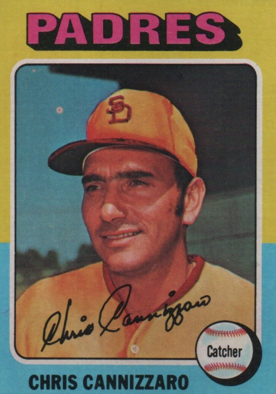
The 1975 Topps Chris Cannizzaro San Diego baseball card was one of the first cards that made me stop and take notice upon seeing it. It was unlike any other Padres card I had seen. The color of the shirt and the way the hat appeared may be called ugly today, but back then, I thought it was absolutely, one hundred percent awesome, baby. This card grabbed my attention due to its uniqueness. I began to search for other cards in the 1975 set that were “painted”, as I referred to airbrushed back then. I searched high and low. A George Brett rookie card, big deal? Robin Yount, same thing. I really didn’t care. They were just too perfect (if I only knew then what I know now about a PSA 10).
Another baseball card that I think is equally as cool is Ken Holdsmen’s 1975 Topps card. He played for my beloved Cubs when the photo was taken, but was later traded to the Oakland A’s. If you take a good look at it, you can see that the A’s symbol on his hat was a little off, which made it one of my favorite cards.
Nice write up, Joel! I loved the air brushed cards of the 1980s.
This was a great read. Thanks, Joel! Looking forward to many more articles.
Im not a collector but also prefer the airbrushed cards…and that kid Jimmy you know so well..hes my bro in-law 😀
Very nice Franky!!! I knew you were a collector but had no idea…well-done